Our Lightroom Secrets Exposed
- November 10, 2019
- Design
We’ve all been there: you get back from a photo shoot, full of excitement, load your images into Lightroom, and don’t have a clue what to do with them. You mess around with dozens of correction sliders for a few hours, but the result doesn’t quite end up like the vision you had in your head.
So, where do you start? Traditionally, you might start at the top with the white balance sliders and work your way down until you hit color calibration. There’s nothing wrong with this method, but if you are unfamiliar with the effects of each slider, your photographs could end up looking noisy or mis-colored; not to mention, it takes forever to test out each slider and see how it affects your unique photograph.
Over the years photographers have created their own presets for certain styles of photographs. They tell you all you have to do is use this preset and your photographs will look as good as the thumbnail image in the shopping cart. What they don’t tell you is that presets aren’t meant to work with every image and are usually just a starting point; correcting the work of a preset can sometimes take longer than if you just edited the image yourself.
Lucky for you, fortunate reader, I created six quick steps to get your images on their way to looking instagram-worthy all while teaching you how to use some of the most common sliders in Lightroom. Let’s get started!
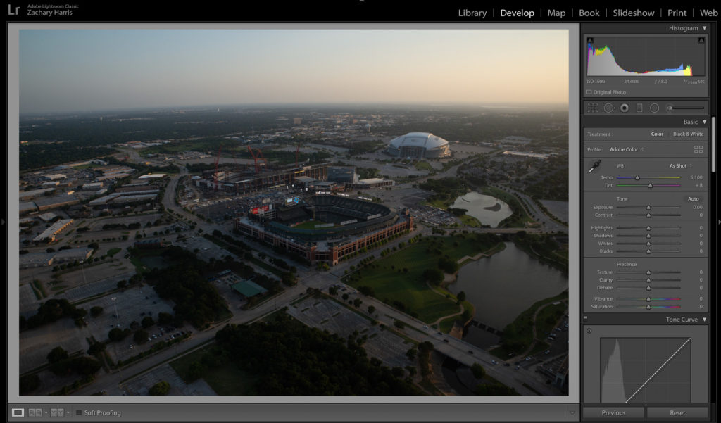
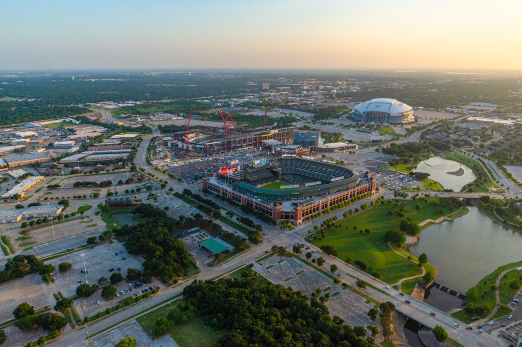
I’ve decided to use an image I took from a helicopter a while back. As you can see, it’s hella underexposed and really isn’t the best looking straight-from-camera photograph.
Step 1
The first thing I like to do is scroll down to the Lens Correction panel and check the boxes for both “Remove Chromatic Aberration” and “Enable Profile Correction”. “Remove Chromatic Aberration” will get rid of the green and purple colored fringes seen in the highlights of your images, usually, they are found in the brightest parts of your photograph. There’s a whole scientific reason behind why it happens, but all you need to know is if you check that box it makes the problem go away. How easy is that? As for enabling profile correction, this will correct the lens distortion in your photograph, up to a certain point, and will usually brighten the image a little bit to make up for the natural errors your camera and lens makes. Lightroom is great at updating their lens profile selections, so you shouldn’t have to worry if your camera or lens will be available in the drop down selection. I like to check these off first for two reasons:
- I will absolutely forget to do it later if I don’t knock it out first.
- Could you imagine editing your image; it looks perfect and then you get to this step and it brings up your exposure by half a stop and ruins your horizon line? Better to edit a corrected image than to have to go back and fix an image you’ve already spent time editing.
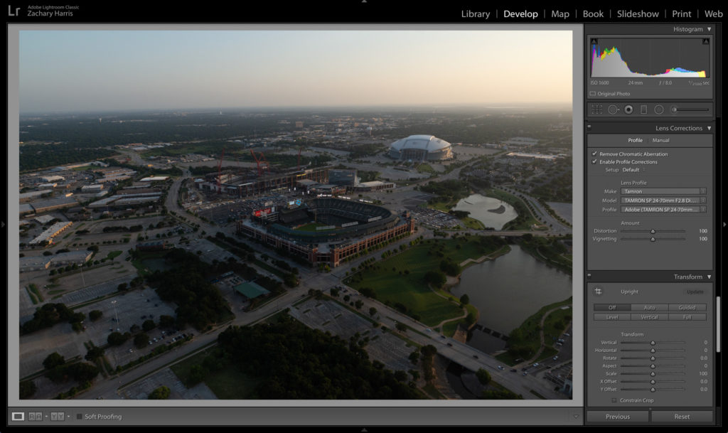
It looks like the same exact image, right? Peep that histogram in the upper right corner. There’s not a lot of change, but it makes all the difference in the world.
Step 2
Next, you’re going to want to scroll all the way back up to the top of the editing panel to the “Basic” correction sliders. Just like you wish you did in 2004, we are going to drop those highlights. Usually I drop them all the way down to -100 because we will bring them back up in the tone curve. Of course, every picture is unique, so drag the slider down as low as visually appealing.
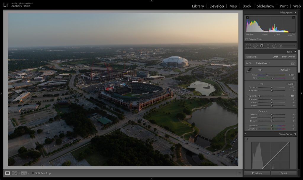
As you can see, all the progress we made in the histogram from step one has been obliterated by step two. Dropping the highlights in this image brings out more detail in the sky, which we can manipulate later.
Step 3
We are going to move down one correction slider to the shadows slider. Take it from 0-100 real quick! This is how we will rescue all the details lost in the darker parts of the image. If you used a high ISO, you might see some noise start to populate in the shadows. Don’t panic! Noise is normal and can easily be removed from most photographs.
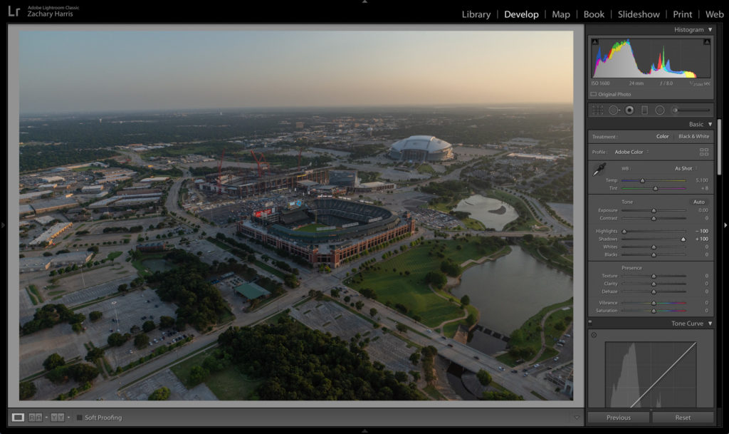
Now we’re cooking with gas! Look at all those details!
Step 4
We’ve come so far, but we’re really just getting started. Go ahead and drop that cursor down to the “Presence” settings right under the blacks slider. Let’s get weird, shall we? Usually, I prefer to edit my photos to look sharp and vibrant. Bring that texture slider up to +10 to crisp up the edge details. I try not to move the clarity slider much higher than +15. It is very easy to get tricked into thinking that a higher clarity looks better because you’re left with a picture that’s super sharp and contrasted. However, unless you’re going for this style, it’s best to keep it conservative with the clarity slider so you have more maneuverability later in the editing process. I don’t normally touch the dehaze slider unless I am trying to get rid of haze from a landscape; even then, I don’t push it much past +10. Like I said earlier, I like vibrant pictures, so go ahead and bump that vibrance level up to +30 and adjust for what fits your project. Word of warning: vibrance will add blue hues to your shadows, so be cognizant of this so you don’t get overwhelmed! Lastly, do what you think looks right for your situation based on the style you are trying to convey.
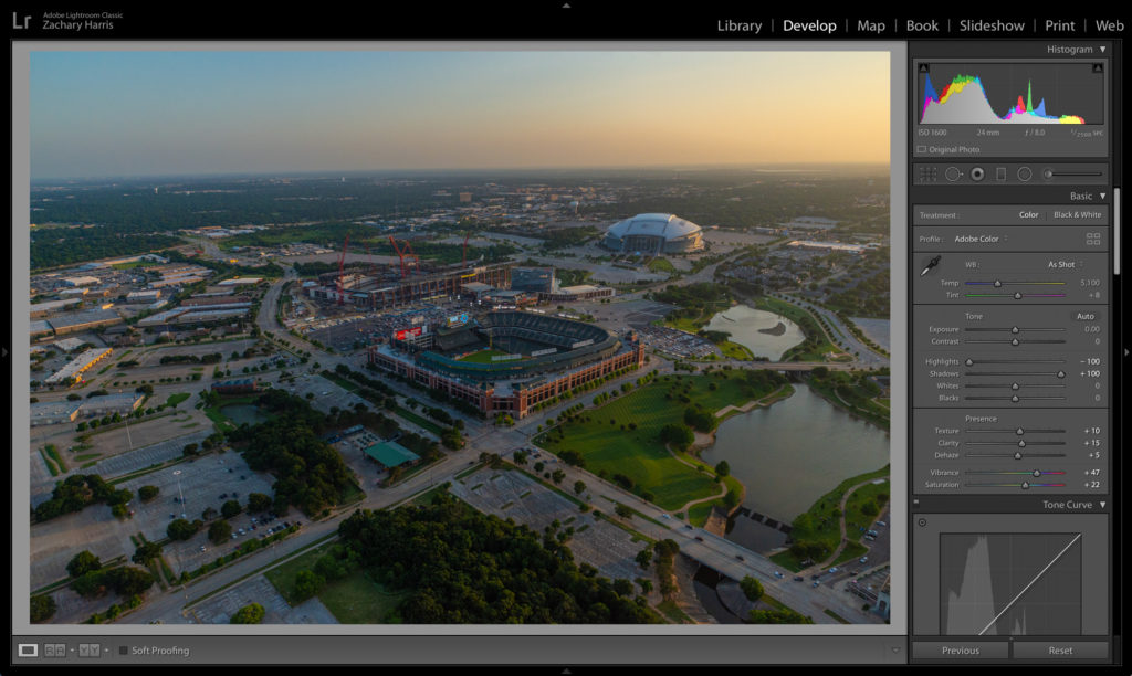
Hot damn! That was one helluva leap we just made! We have just enough stylization and colorization to give the subjects some pop, but not too much so they feel unnatural.
Step 5
Now that we have the color where we want it to be, let’s scroll down to the tone curve menu and fix that wonky histogram. If you are unfamiliar with how a tone curve works, you are not alone. Lightroom made it very intuitive to use by creating sliders instead of making you use the actual curve graph (I don’t know if this is a real thing, but it sounds legit, so we’re just going to leave it in). For about 90% of my photographs, I edit the tone curve with the following:
- Bring the highlights up to +10
- Bring the darks up to +50
- Drop the shadows to -10
- Adjust the lights appropriately so your image is properly exposed
Following this method when tackling the tone curve will give you a solid base for most of your images and will result in a bright image with a true black and true white source in every image.
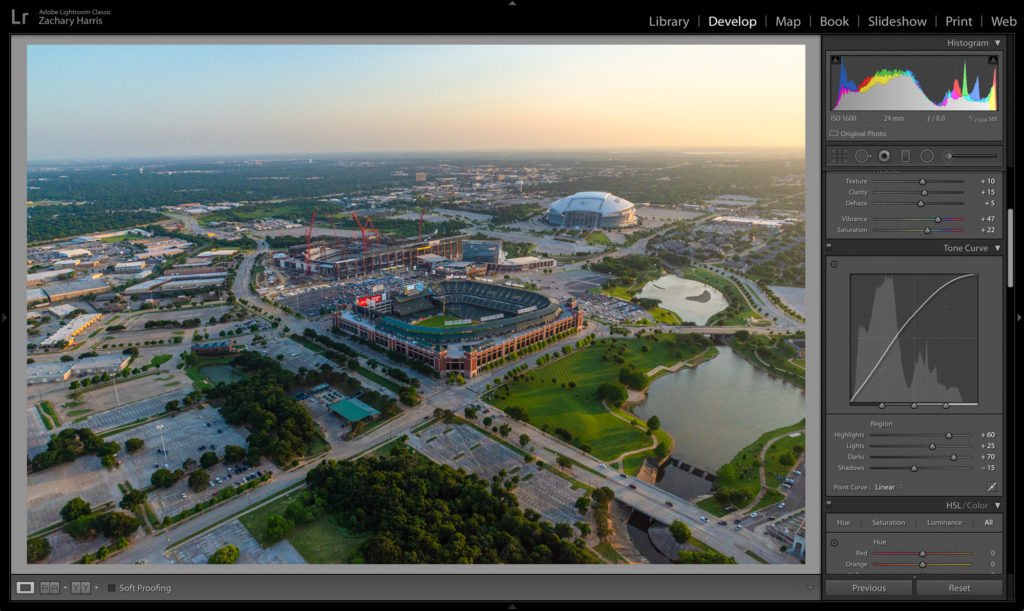
Can you believe this is the same picture we started this tutorial with? I mean, it looks like a completely different photograph! There’s just one thing missing.
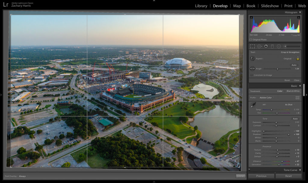
Sstep 6
Lastly, we have to fix that horizon line. Go ahead and click into the crop tool — it’s the first icon at the top of the menu under the histogram. If you have a horizon line in your shot, grab the straighten tool (it looks like a ruler), and click and drag from one side of the horizon to the other. If you don’t have a horizon line, use the guides to line up the center of your image so that it’s straight.
You did it! You completed the 6 steps of Lightroom! Of course, we just barely scratched the surface as to what Lightroom allows you to do. Now you have a solid base image that everyone on your Instagram feed will double tap.
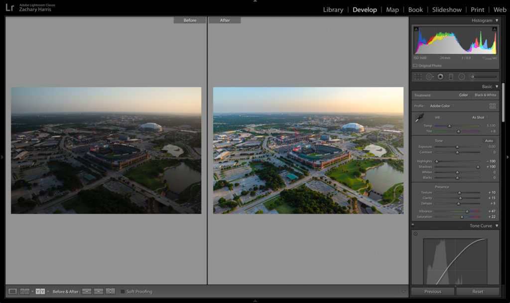
Here’s a little before and after for you so you can see just how far we’ve come with a few simple corrections. With just six steps, you can take your image from bleh to wow!
What a journey we’ve taken! There’s been a lot of information thrown at you, and honestly, I’m exhausted, so I can only imagine how you feel. So, I’m going to make it easy for you. Below are all six steps spelled out for you so you can easily reference them without having to read through this entire post.
- Check off both boxes for:
- Remove chromatic aberration
- Enable profile correction
- Drop highlights
- Raise shadows
- Play around with the presence settings until you get the style you are looking for
- Mess with the tone curve — Boost the highlights and darks, drop the shadows, and adjust the lights
- Use the crop tool to straighten your image
Do you want high-quality, vibrant images but don’t have the time to do it? Get in touch with us now! [email protected]
